Not everyone can agree on what makes a great looking football kit, yet it seems like fans can universally agree on what makes an ugly one. The last 10 years have seen thousands of football shirts designed and manufactured for professional teams around the globe. Some were hits and some were complete misses. For this week’s blog, let’s look at some ugly shirts your mum wouldn’t even be proud of you to wear. Then, you tell us, are these the ugliest football shirts of the last decade?
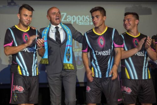
Las Vegas Lights
CD Palencia
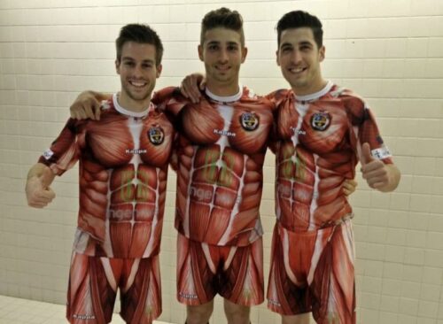
Founded in 2011, CD Palencia play in Spain’s Segunda Division B. The club debuted one of the most unique and ugliest football shirts in 2016. Imagine looking at the inside of a person’s body at their muscles and tendons. What a terrible kit.
Manchester City
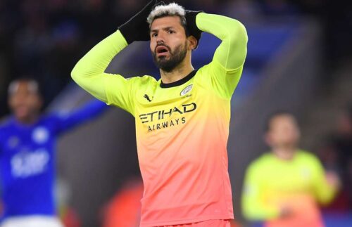
Manchester City signed a mega-money kit deal with Puma ahead of the 2019-20 season. Unfortunately, the club were handed a dreadful third kit that featured highlighter yellow mixed with peach.
Cultural Leonesa

Cultural Leonesa debuted a special tuxedo kit in 2014-15 for charity. The kit resembled a black tuxedo with the goalkeeper’s shirt being a white tux replica. The kit received a massive amount of attention on social media due to the unique, yet ugly look.
Club Deportivo Guijuelo

It seems that there is something in the water in Spain as Club Deportivo Guijuelo released an interesting shirt in 2015. The orange top had some similarities to the shirts of the 1990s produced by Umbro and other manufacturers. A look closer at the shirt and you will realise it has pieces of ham decorating it. The ham motif is a homage to the Salamanca region.